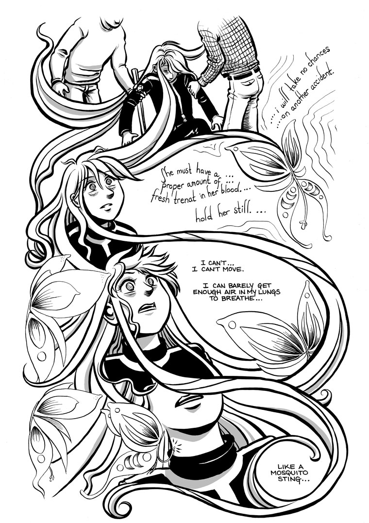
On this page I decided to try a post-production tweak of just the tall “s” letters in the Miesti dialogue, to determine if that small fix alone with solve the legibility problems. What do you think? Is this enough, or should I also consider straightening out the “balloons” a bit more?
Also, if you’re wondering why “like a mosquito” rings a bell, you may want to flip back to this page from Chapter Four.
We also have a new blog post today, which is a re-posting of an article which originally ran a couple of weeks ago on the “webcomics tutorials and advice” site, Webcomics.com. I’m sharing it here on my own site not so much because I think you’re all keen on picking up some traditional drawing tips, but because I thought you might appreciate the sneak peek at an upcoming page. ![]()


That is much more readable.
I imagine that when they get back Tersa regulations will be re-written to include always wearing containment suits until local fauna has been categorized completely. Just imagine how much less drama there would be if someone had thought to include that rule…Nah, that would be much less fun. After all, we wouldn’t be getting this nice view of who the Miesti are if the landing party had been wearing containment suits.
Considering that almost all the planets they explore are devoid of atmosphere, much less life, I’m not actually that surprised that nobody thought about biological contamination on atmosphered worlds. Also, I get the feeling that the guy who met the first aliens wrote a memoir and then TerSA adopted his methodology for making peaceful contact wholesale, rather than putting said methodology through a wringer.
Suits and basic weaponry, at least when on a planet with possible sentient life-forms. Idealism must sometimes make way for basic survival insurance.
You can’t give contact teams weapons, it’s too tempting to fire them in unknown and unknowable situations. First contact teams are, by necessity, expendable. You can’t know what will happen due to mistakes on both sides of a First Contact situation, and you want to limit how much it is possible to screw it up.
Their reasoning for their no-weapons policy is sound. Or at least thought out. Running around in their shirt sleeves on a world they have not yet surveyed is just sloppy.
After all, how many times did Kirk et all get stuck on a planet because they beamed down in shirt sleeves rather than wearing space suits and enacting a quarantine.
What a civilian way to put it… expendable…
If that’s a civilian way to put it, then fortunate that civilians make the decisions! Rather lose ten of my people nowtha a hundred in a reprisal that could have been avoided…
I like the new lettering! The “S” is still there a bit for flavour, but you can easily make out what is being said – good edit!
yes, as soon as the “s” look more like “s” it gets much easier to read
So are the regular “s” lettered words in that dialogue being spoken by somebody else?
sure – that’s Aria thinking
but, yes, the focus on the lettering also got me confused for a moment
The curved and lowercase words are the Miesti speech, and the straight and uppercase words are Aria’s thoughts. This is the same pattern as what I used on previous pages, but the difference is I substituted normal-looking “s”es for the tall thin ones I used before.
Sorry about the confusion!
This is much easier to read—thanks!
Poor Aria. Not to mention, poor Patty! Patty must be suffering some sort of adverse reaction to the… trenat? …she got from the Miesti she swatted in chapter 4.
By the way, what happened with her hair?
OK, here’s what it is: physically, the only thing that has happened to her hair is at some point her braid came undone (actually, you can see this happening early in the chapter). Visually, the crazy hair represents her currently skewed grasp of reality. Related to this is this section’s lack of panel borders and any kind of balloon to surround Aria’s inner dialogue.
I expect this visual metaphor will be more obvious in a few more pages, or when you have a chance to read this chapter (once it’s finished) all in one sitting.
Muuuuuuch easier to read, I think that did the trick!
Excellent. Even my old eyes can read it!
This the first time the font has not overpowered the dialogue and I could just enjoy the story.
I like the hair-as-panel-border. It has a nice art nouveau feel to it.