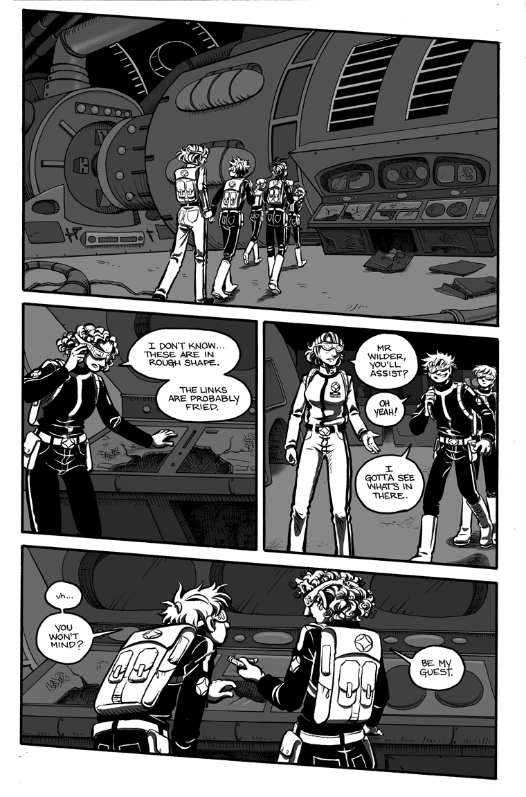
For those of you who recognized the Hiawatha’s bridge, the design of her engine room will come as no surprise. ![]()
I actually liked this page better without all the tone, but I needed to keep up the “we’re in the dark here” (and also still on a slight incline) motif I’ve got going! But if you’d like to compare, here is the plain black-and-white page.
I’m not sure if anyone will remember (and to be honest it’s no big deal if you don’t), but way back in A Matter of Principle, the very first story I wrote for the Galaxion webcomic (and the first pages I drew after that long break from comics I took between 2000-2006), we learned that Vessa also has a talent for fixing things. I don’t know that Zan is necessarily aware of this, but he is aware that Vessa isn’t the sort of person you want to annoy if you can help it! Poor Zan’s still trying to find his footing in his new place on the Survey Contact Team.


I think it looks bloody fantastic in grayscale! It allows you to add those nifty highlights.
Hey! That engine room is from the 1701-JJ’s engine room/brewery, right! (kidding).
Zan: Hey! These mugs are still frosty! That’s a good sign!
And Zan better be careful, most starships store fireworks inside control panels. (Told you there should have been red shirts
Looks to me like the Yamato’s wave motion gun, actually.
I like it better with the greyscale; there’s a lot more “depth” to the image, and it’s a little creepier.
Yeah, I agree with Galen. With the grey, there’s more depth, and atmosphere.
I was gonna say nice use of negative space and sound all smart and art-wise. Actually, i just read an article yesterday about negative space so barely know what the heck it is, lol. Never heard of it til then really.
I like the tone though, it really does look like they’re in a “light challenged environment”! And I’ll be going back to the front and catching up, you’re added to my ‘regulars’ list of comics.
Actually, I do rather like the tone better– it gives the page as a whole a good sense of depth, and you can really feel the shapes of the panels and the objects within them.
This could just be a personal preference based on taste, though. The straight black-and-white looks great too. (: