For those who may desire it: a quick link back to the beginning of the chapter.
Way back in the beginning of the Galaxion comic– and in fact, from way before even that, when Galaxion was a novel-in-progress for which I drew many illustrations– Aria wore her hair loose. You can see what I mean from the first page of that 1993 story, and this collection of some older Aria head shots. And then, somewhere along the way, I reluctantly accepted the fact that having long hair blowing all around during her Survey Contact missions, no matter how fun it was to draw, would be incredibly irritating. (Not to mention looking unprofessional.) So I had her put it up in a tidy French braid. And she’s worn it up ever since.
Those of you who have ever bought a graphic novel from me at a convention (or purchased online and requested a signature) may have wondered why, when I draw a quick head sketch of Aria in Volume 1, I always draw her with loose hair rather than in the braid. Now you know. It’s an artefact from earlier days.
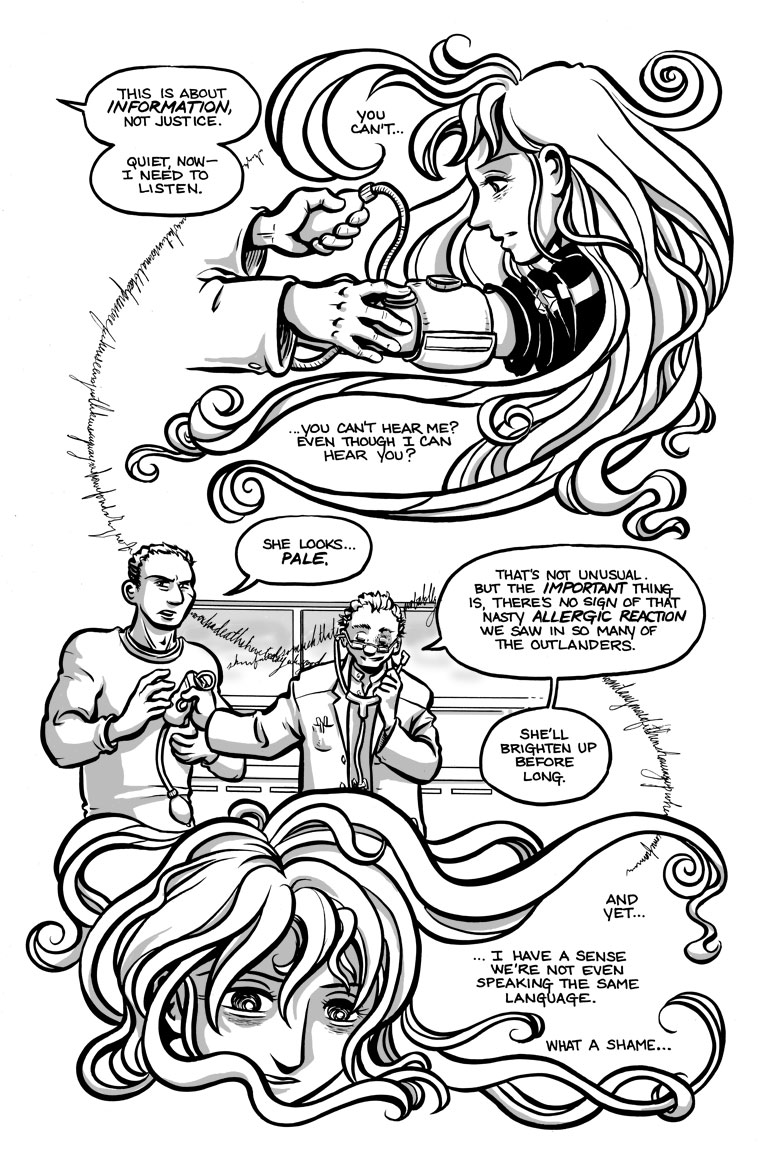
This chapter is where I make up for all the previous chapters of restraint in drawing Aria’s hair tucked neatly away. Hahaha, be freeeeee! *ink brush flies crazily all over the page*


Haha, yeah, like Faye in Amya Chronicles. Wild flowing hair FTW!
I got to meet one of the writers of that webcomic last summer, and then bought some issues. The art is so pretty!
I agree! I’m not too surprised you’ve met.
“Nasty allergic reaction“??? Poor Patty.
What is all of the text circling the page? I can make out what looks like “death” between the two men, but I have a feeling the writing is too fine for the scanner; that, or it isn’t really text at all
I spent some time trying to figure out the super-cursive writing on last week’s strip, too, but couldn’t make out meaningful sentences for the words I could make out. I’m assuming that’s deliberate–to be just on the other side of comprehensible. :0
You got me curious, so I went and had another look at the original art. More of the words are legible there, but the effect is meant to be like muttering, or maybe whispered conversations from across the room– you can understand some of it if you concentrate, but not all. Not being able to read any of it shouldn’t affect the story. Anyway, the scanner is not at fault for legibility problems– the low resolution is the result of publishing on the web. The printed edition (and also the digital-book edition, to a somewhat lesser degree) should have more clarity, for what it’s worth.
Okay, from what you’ve written, I think the super-cursive text accomplishes what you wanted it to do. But the situation is like seeing the short film Skwerl for the first time–you’re not quite sure whether something has gone terribly wrong or where.