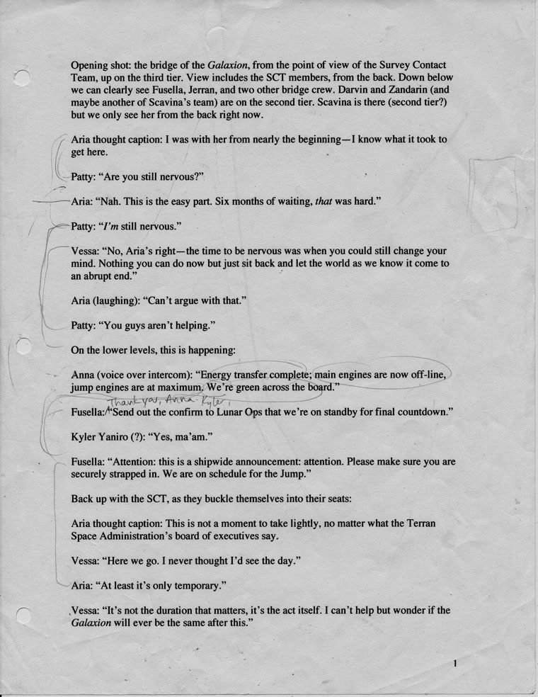
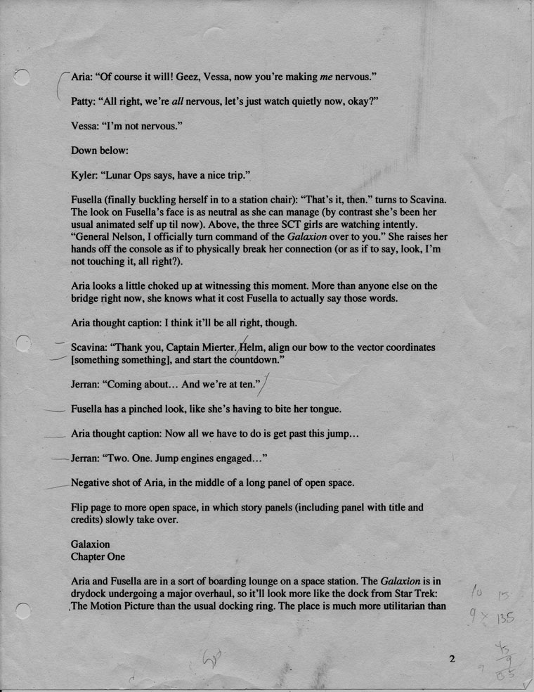
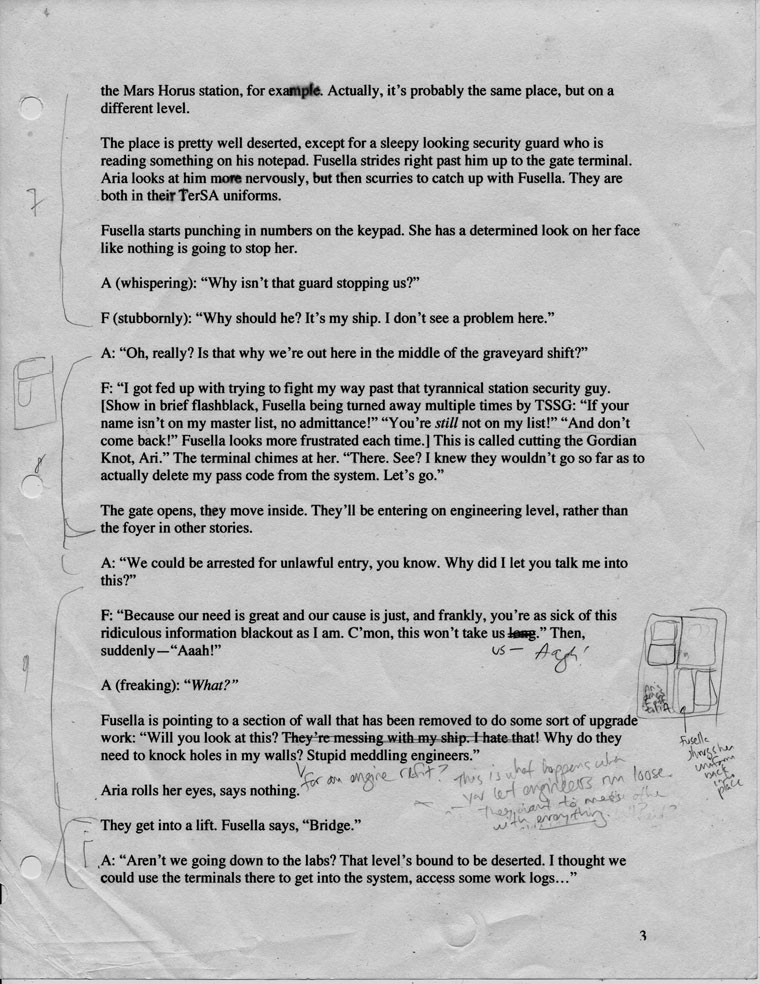
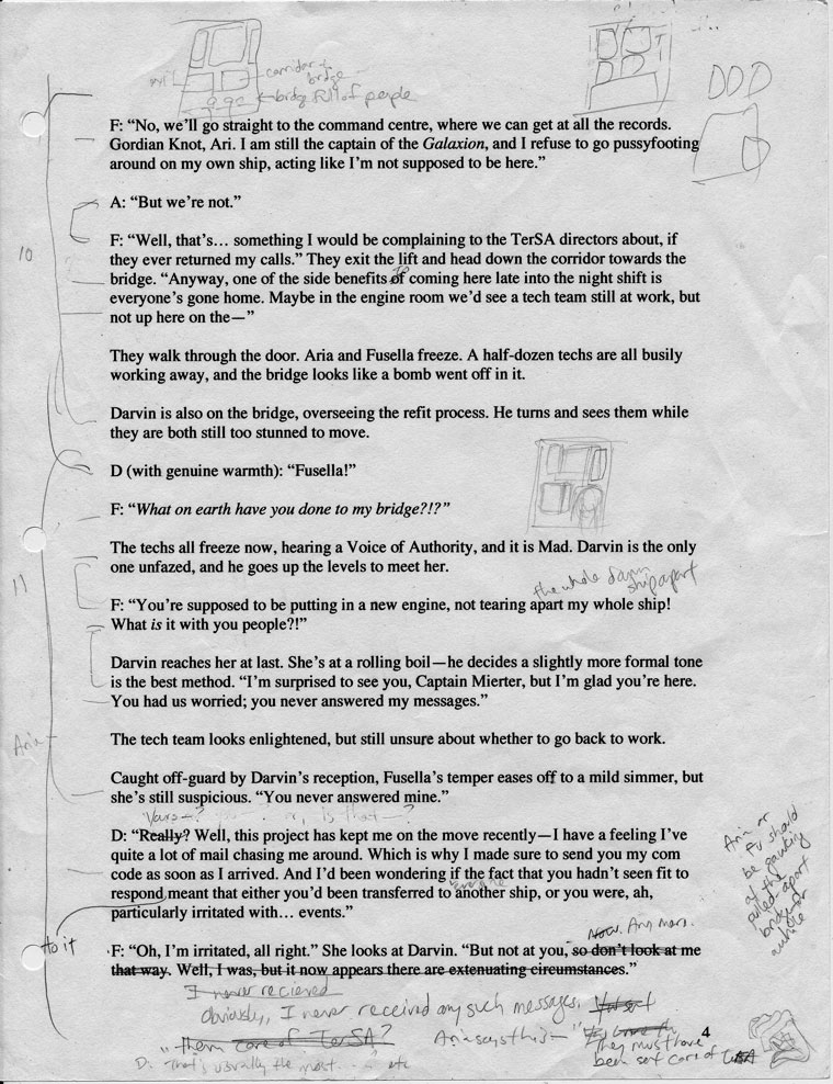
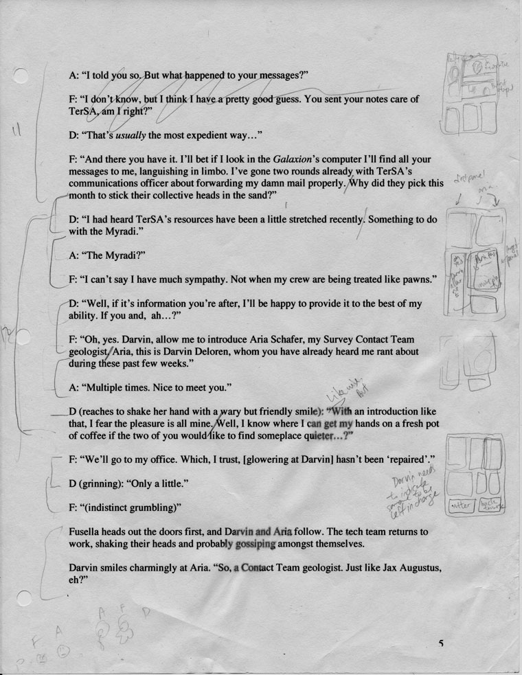
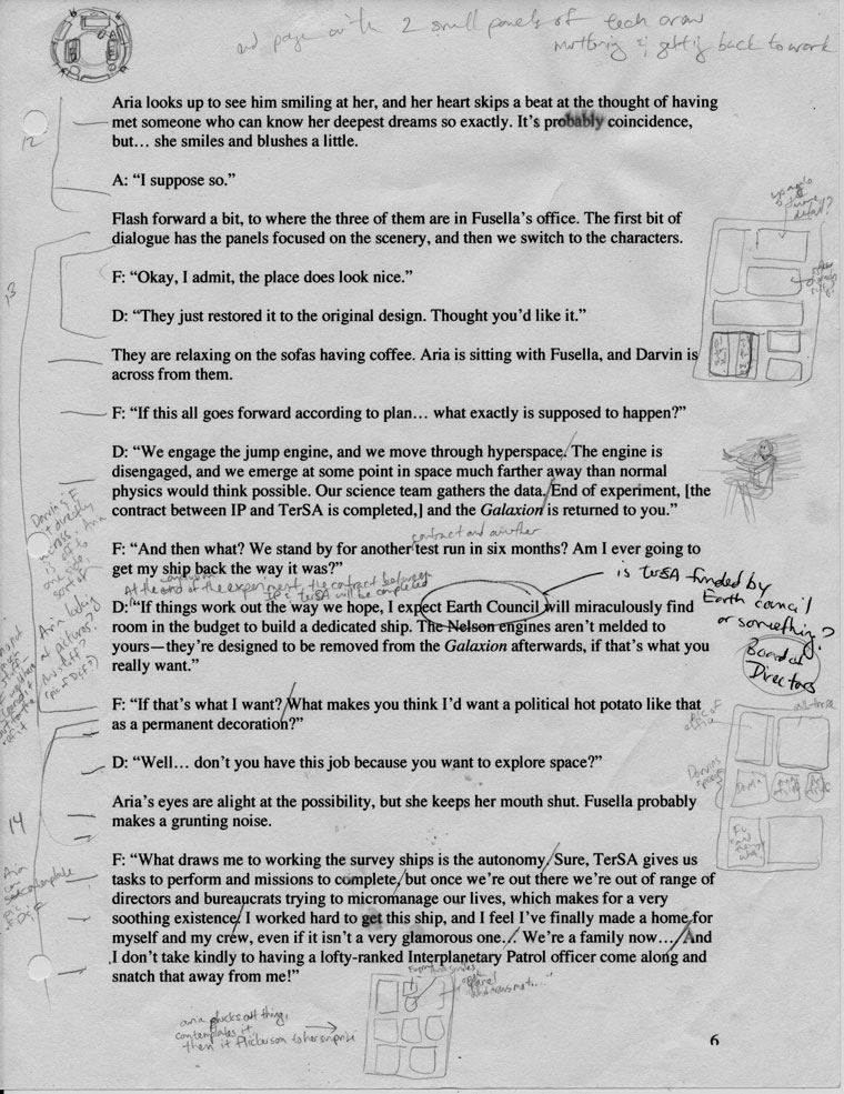
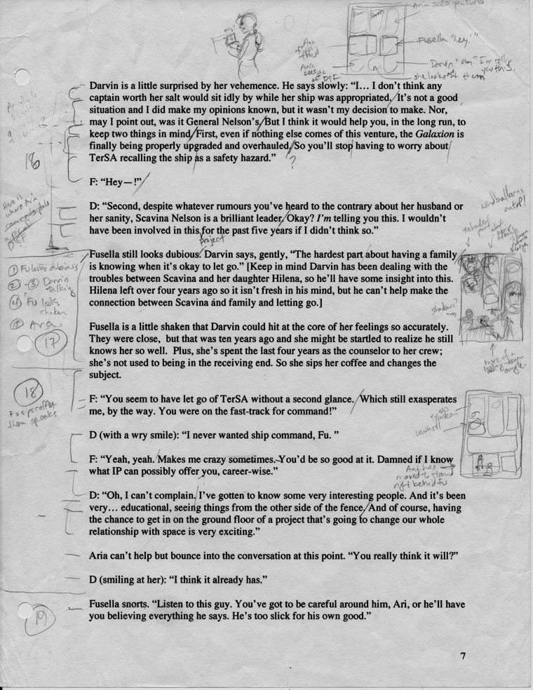
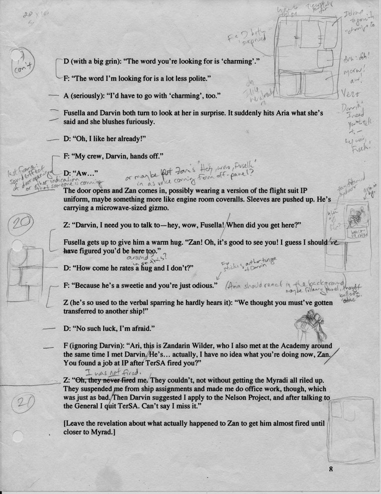
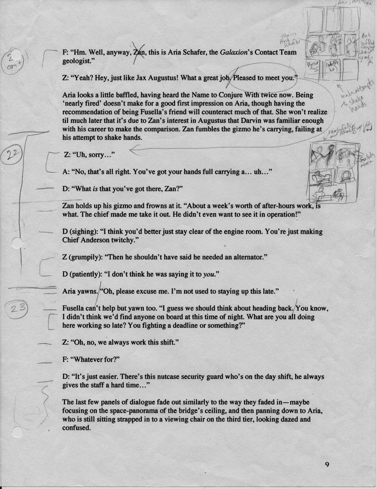
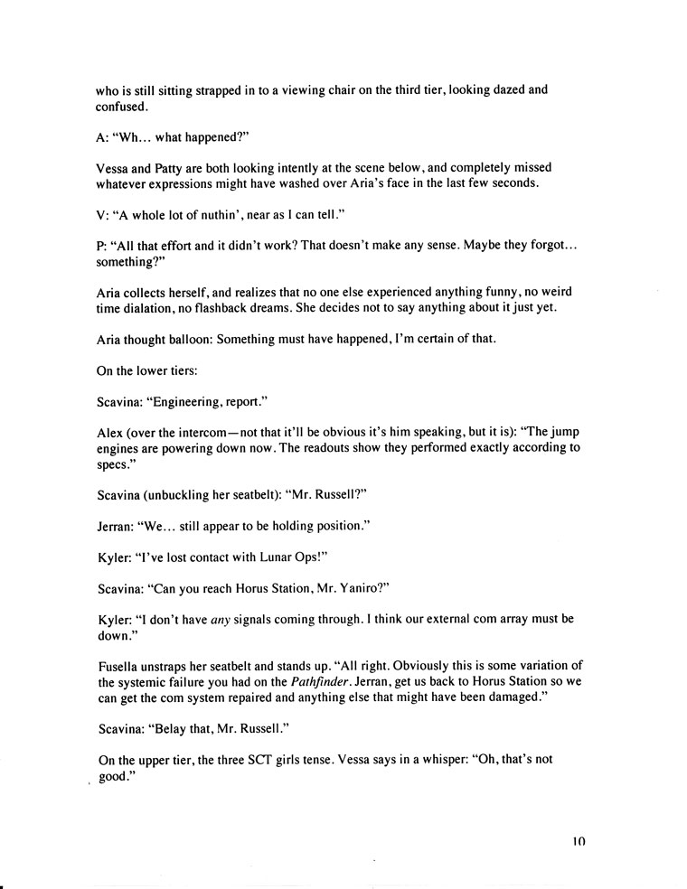
There is a second step after I make these little thumbnails, before I start penciling on bristol– I make a larger thumbnail, working out a little more of the layout detail, and roughing in the word balloons. I discovered that if I don’t do this step, I end up erasing too much artwork in order to make the word balloons fit.
There is an upper limit to how much dialogue you can fit into one word balloon without losing readability. It’s probably around three sentences– after that you run the risk of your readers glossing over your verbiage. Why is it that we have no trouble reading a page of text when it’s just text, but the minute you add pictures our ability to read whole paragraphs at a time seems to evaporate? I guess the pictures are just too compelling for our eyes to waste time lingering on all those words. Bottom line– break up your paragraphs of dialogue into bite-sized chunks for easy visual digestion. Example: I broke up Fusella’s three-line paragraph of dialogue on the bottom third of the script page into three separate balloons. There, much easier to swallow.
