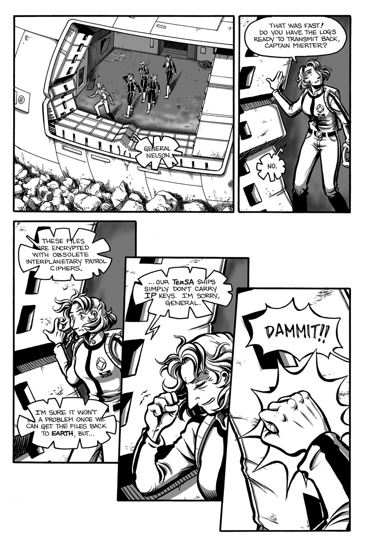
Yay! Sunlight! No more goggles! *dances around chair in celebration*
I’ve gotten so used to doing grey tones, though, I could probably continue on doing them for small areas of contrast and shadow (like the way I’ve done on this page, in the areas outside the airlock). What do you think? Do you prefer the stark black and white, or are the greys worth keeping?
Also, in case you missed it, I posted a sample script, with commentary, last Friday. It’s kind of an interesting look at one part of my creative process!


Well, that last bubble looks familiar…
The grays are nice touch to the otherwise “stark” black & white–definitely worth keeping.
Grays are worth the trouble, IMHO.
Well, for what it is worth, the grays make the artwork much more appealing than stark black and white. At least to me. My vote is to keep them.
-Paul
Yeah, I like the greys. But I just hope you keep it all in proportion. It’s a nice change of pace though.
I like the greys, they provide a level of gradation that stark black doesn’t offer. Which, thinking about it, is pretty much the definition of “grey” versus “black and white”.
Tangentially, I really like the way you add spikes to the radio speech balloons to imply static. ^_^
The black and white looks nice, but there’s so much more depth with the grey tones. I vote you keep them.
Definitely keep the grey. It adds so much more depth to the art and I’ve always kinda found the black and white to be a little dull, as in boring.
Please keep the greys – they’re more effort, but they really add depth to the art.
I take it that the IP ciphers, being military, aren’t something an exploration vessel would need? In that vein, I’m curious to know how the crew understands that the ciphers are ‘obsolete’? If they don’t have access to them, how would they know what was current?
“I’m curious to know how the crew understands that the ciphers are ‘obsolete’? If they don’t have access to them, how would they know what was current?”
That’s not hard to understand – the part of the file which describes the type of encryption used is itself unencrypted. To put it in current-day speak – instead of ‘cipher’ think ‘file format’. Now imagine they’re running the latest and spliftiest Linux computers – and have just downloaded a bunch of compressed DOSWriter II files. Pwned!
Heh… Jeff, you have a better explanation than the one I was going to come up with!
The only thing I would add is, TerSA– and by extension, the Galaxion– has it’s own set of ciphers that it uses for whatever messages it wants to keep private. IP, being another organization, uses different ones. If, for example, the Pathfinder had succeeded in accomplishing the same trick that led the Galaxion to finding the Hiawatha, they likely would have had all the codes stored somewhere in their computers, and Scavina wouldn’t be facing this little stumbling block.
The grey tones are nice. They do give it a more technical feel, which is fitting for sci-fi. But I am sure you could make it work either way. Keep up the super work.
grey or not? that is of course a rhetorical question, isn´t it? perhaps some psychological thing so you get the positive feedback xou deserve
grey is beautifull!
grey is the new black!
(did i mention that i like your whole work?)